Home › All dashboards › PM2.5 Air Pollution
PM2.5 Air Pollution — Power BI dashboard
Dashboard shows exposure map of PM2.5 pollution with environmental data for managers and researchers
⚡ Built with GPT-5.6 Sol
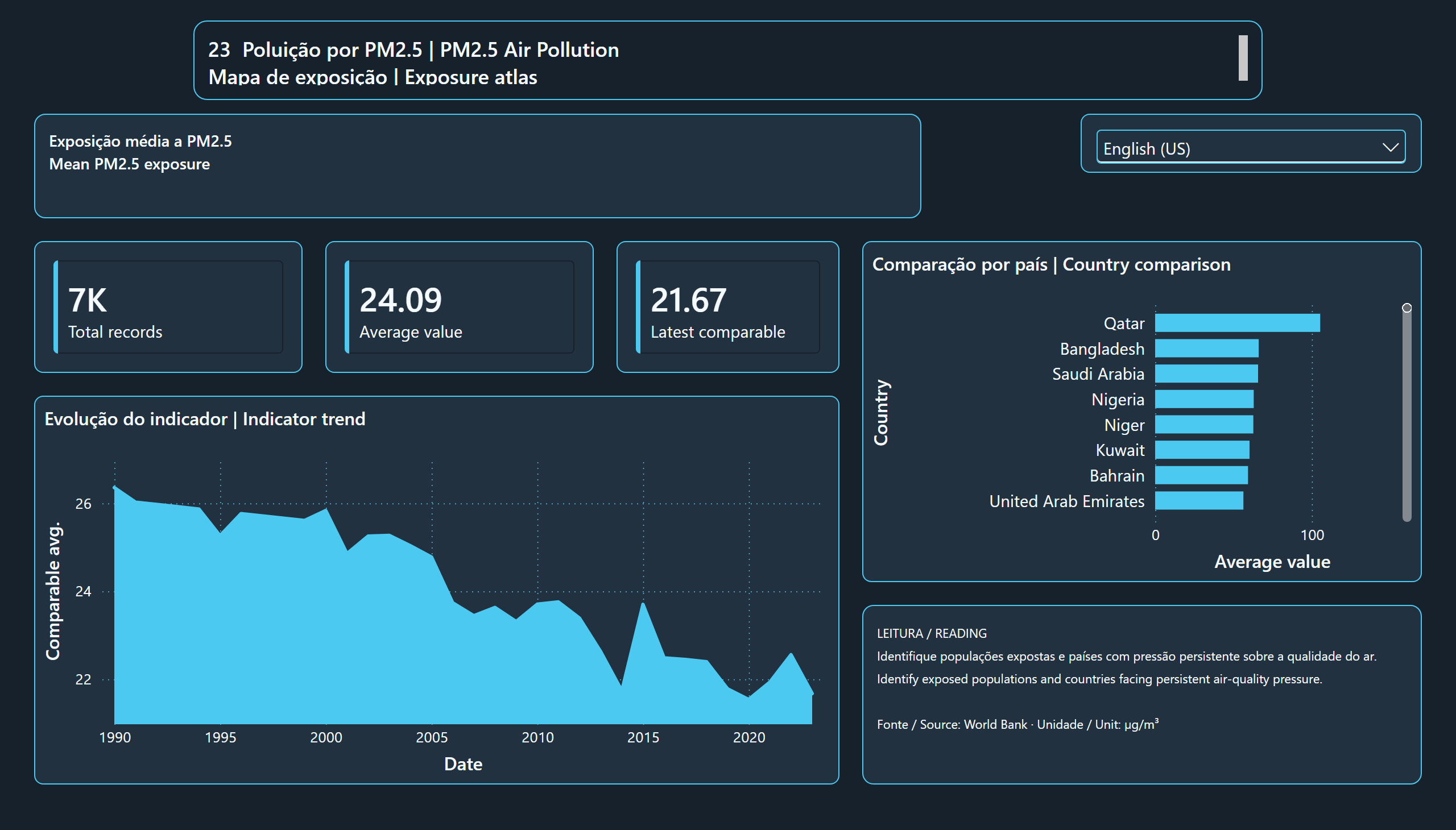
This dashboard features a detailed map of PM2.5 air pollution exposure using environmental data collected from public sources. It enables visualization of the spatial distribution of particulate matter concentrations, helping to identify areas with higher or lower exposure.
The dashboard is intended for public managers, environmental researchers, and health professionals who need to monitor air quality and assess the impacts of atmospheric pollution across regions. It supports decision-making and environmental policy planning.
What's inside
- KPI cards with total records, average value and latest date.
- Trend-over-time chart and a ranking of the top categories.
- Detail table with category, subcategory, date and value.
- Language selector inside the report itself: English and Portuguese.
Interactive report
Use the language selector inside the report to switch between English and Portuguese.
Loading the report…
Take this dashboard
You get the `.pbix` with the data already inside — it opens in Power BI Desktop and works offline, with nothing to configure — plus the editable PBIP project and the source documentation.
Only if you want the invoice in your name. The purchase works the same without it.
Use, modify and use commercially, including in client work. Reselling the file itself is not included.
Want one of these on your own data?
These dashboards run on public sources. The same process runs on your database — you share only the data structure, never the data itself.